The Three R’s–Rubbersheeting, Rendering, and Regret

Well, my perfect track record of hitting complications and failing to find a workaround continues.

I have been able to figure out draping/rubbersheeting, but I have not been able to convert that file into something readable so that I can post it to this blog. I have tried converting the file from .dsx (I exported it from NSD first) into a .pdf but my Illustrator keeps going down; I suspect my laptop can’t handle the task. So tonight or tomorrow I’ll got to campus and try and find a work station to do that at.

Aldie render


[edit: SUCCESS!]

I learned a few things from this process; one thing is that these files get pretty big. I also learned that by putting a topographic map over a terrain map, I can make the visual information about elevation and slope much clearer and of course this makes the camera view much more illuminating. I will try to put together a better, more comprehensive map for our atlas project (this one is really small) but at least I’ve tackled the basic technical issues despite the hiccups I’ve experienced.

Last night, on a whim I decided I should try and do the architectural reconstruction project in case I was unable to solve the issue with exporting my map. I decided to try the Aldie Mill, which is a three-building complex in Aldie, Virginia, which was the endpoint of the Little River Turnpike and an important center for flour and meal production in northern Virginia. Two turnpikes connected the farms of the Shenandoah Valley to the Aldie Mill, so a great deal of the flour delivered to the port of Alexandria came from here. My thinking was–I hadn’t put much time into Sketchup but I found it reasonbly intuitive, so I thought what the heck, I’ve got a few hours and the Aldie Mill is a pretty basic brick structure–let’s go for it.

Well, I was right about the mill buidings–I was able to knock those out reasonably quickly, after wasting FAR too much time sweating the exact size. Being that they are square brick buildings with stone foundations and tin roofs, it wasn’t long before I had the basic buildings placed in roughly to-scale proximity to each other. I even found a reasonable model of a waterwheel through the 3D warehouse. It took awhile to get going, and it was already a little later than I would have liked, but I thought I was on the way to having a really good model.

But after a little while, I realized I’d made a couple of errors. One–because I’d seen pictures of the mill online, I assumed that those pictures would suffice for a full reproduction, especially given that I’ve actually visited the site. However, I quickly realized that the bulk of those online pictures are of the same few views. There are no views I could find from the north end, nor of the retaining pond which feeds water into the trough over the wheels. I was able to get ample views of two of the three buildings, and at least two sides of the third (northernmost) building, but by waiting to the last minute I had prevented myself from getting enough visual information to make all aspects of the model accurate.

Secondly, I struggled a great deal with how to show the foundation and the lower walls on the south side, where the wheels are and the canal carrying water away from the mill back to the Little River is. I wasted a great deal of time on aborted, sloppy work-arounds, which was frustrating because up to that point my work had been, if not skillful or particularly elegant, at least I was utilizing the functionality of Sketch Up in a rational way. But now I was just drawing things in hopes of “faking” a cohesive answer to what was clearly both a conceptual and a technical shortcoming on my end.

Ultimately I realized that what I should have done was to have started with a ground cover of some kind; then I could have marked out a canal path and lowered it, and filled in the stone walls and so forth from there. Doing so would have not only been the more efficient solution. However, my lack of a good picture of the retaining pond, how it feeds into the trough, and the entire north side of the complex probably doomed my efforts.

I finally gave up on the project when I realized that when all was said and done, the mill itself is still standing and while some external features recorded in pictures no longer exist, a modern photograph of the current structure will more than suffice for a visual representation. Given that there’s only a month left in the semester, I will simply present what’s left of my ‘working draft’ without further comment:

Image

Caption: “The big thing with a blue top was going to be a retaining pond.”

Do I regret spending last evening on this failed venture when time is pressing? Not really. I did learn a few things about Sketch Up, and while I don’t think my project really calls for any architectural reconstruction, that’s not to say I won’t someday find a use for this skill. I still have a lot to learn, but I learned quite a bit even from this failure, and I mostly learned that Sketch Up is not an intimidating product to use. It just takes time, and a good understanding of what it is you are setting out to do. Last night, I had very little of the former, and not quite enough of the latter. Lesson learned, and now it’s time to move on.

aldie main building

Above: The main (middle) building of the Aldie Mill. I had hundreds of pictures of this view, but not a single one of the north end of the complex. I need to take my camera next time I’m in the neighborhood.

GIS and the Spatial Humanities

Our readings for this week–chapters 8 and 10 in The Spatial Humanities: GIS and the Future of Humanities Scholarship–directly address the fact that while GIS is a powerful tool, it is not ideal for the humanities for a number of reasons. Most importantly, “latent tension, if not direct conflict, exists in linking a positivist technology with predominantly humanist traditions,” (168) But rather than see this tension as creating a conflict, Trevor M. Harris, John Corrigan, and David J. Bodenhamer argue that a true “Humanities GIS” needs to learn how to use the possibilities of spatial technology in ways which are in line with humanities values and methodologies.

 Also, I really liked the idea in Chapter 8 that Geospatial Semantics Web might provide a “good enough” solution for many, if not all, Spatial Humanities challenges, while also reducing the disconnect between user and creator created by, among other issues, a lack of technical proficiency on the part of many humanities scholars and practitioners. They reference the famous “80/20” rule (which I never knew was invented by an Italian economist, Vilfredo Pareto, until I read this chapter), to emphasize the point that while GIS technologies may not be perfect for humanities approaches, and while humanities users might not need or master all of the functionality of GIS technologies, we should be comfortable knowing that existing GIS approaches will be suitable most of the time, and that we can do most of what we need to do with a fraction of their possible utilities.

Given the sometimes daunting prospect of mastering all the tools we’ve looked it, these readings were a comforting return to perspective and a humanities-centric vantage.

Spatial Awareness in “The Shining” pt. 1

This is the first of a two-part video by Rob Ager in which he analyzes the floor plan of the Overlook Hotel in Stanley Kubrick’s film “The Shining” (based on the Stephen King novel). Ager argues that the floor plan is deliberately “impossible” and the reason for this is so that the viewer is subconsciously disoriented. The urge to “map one’s way” through a fictional world is strong, and Ager argues that Kubrick exploits this fundamental urge in order to give his film more psychological effect.

Personal Geographies and Imaginary Worlds

Our two readings for this week both involve what the subtitle of Katherine Harmon’s You Are Here” refers to as “maps of the imagination.” Whether discussing maps of fictional/imaginary places, as in Ricardo Padron’s chapter “Mapping Imaginary Worlds” from Maps: Finding our Place in the World, or the wide variety of unique, interpretive, and often artistically stunning maps in Harmon’s book, the variety of subject matter, points of view, aesthetic choices, and political/ideological perspectives is the first thing you notice. After awhile, though, I found that I could really appreciate that there is a deeper commonality running through all these different maps, and that is that they are all–maps. As Padron writes at the end of his chapter, 

“And so, while maps of imaginary worlds do indeed delight, distract, reveal truths, whisper secrets, unsettle, reassure, perhaps they do not do so because they are maps of imaginary worlds, but because they are maps.”

The idea that the map itself is more than a form or even a genre but is instead an actual mode of thinking about the world and our place in it–that’s an idea that could apply not just to this weeks readings, but to this entire course.

Map Users as Consumers

Of all the readings for this week, Diane Dillon’s chapter “Consuming Maps” from Maps: Finding Our Place in the World spoke to me the most. Like many other people in the class, I am an almost habitual consumer of maps, including in any number of situations where map use really isn’t necessary or even helpful. My wife could probably recall all sorts of situations in which she was impatiently waiting for me in a parking lot in the middle of nowhere while I walked around trying to match the map in my hand to the street or road I’m actually walking beside–instead of getting back in the car and following the clear directions she printed off MapQuest.

One point Dillon makes over and over again is that when we look at maps as consumer goods, and at maps which were made to be consumed in some way, we need to consider the financial motivations of the map makers. There is nothing cynical or reductionist about that. Just as a 17th-century British map of North America showing the French crowded up in Canada and the interior devoid of native peoples served the interests of the British state by justifying British claims to land and implying that it was free for settlement, road maps distributed by gas stations not only encouraged car owners to drive more, and therefore use more gas, but also associated that mobility and freedom to explore with a particular brand of gasoline.

Belated post–my Illustrator-drawn and hand-drawn maps

I apologize for not getting these up in a timely fashion. I won’t pretend they are worth the wait, but I got cheap all of a sudden and refused to pay UPS or Kinkos to scan my hand-drawn map; in the meantime, I haven’t had time or reason to come to campus in over a week.

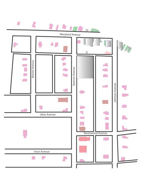
At any rate, for my digital map, I spent a little more time fleshing out my Sandborn map, which is a section of Hyattsville, Maryland in 1909. I selected Hyattsville because I used to work there, and also because everybody else was picking relatively interesting locations and I wanted to pick somewhere kind of boring.

Based on my study of this part of town, I got that last part right–Hyattsville in 1909 was a dull place, no saloons or taverns, no public places other than a Masonic Hall, but several churches within a couple of blocks of each other. Granted, this is only one section of the town, but at least some of it seemed to be a commercial stretch abutting the railroad, so if there was going to be any action in town you would think some of it would be there.

I color coded each different type of building; houses are the most common. Also noteworthy is that even in this seemingly well-developed part of tow, there were quite a few vacant lots. I don’t know anything about Hyattsvilles’ history, but if it was a commuter suburb of Washington DC that might explain the undeveloped nature of this neighborhood, and also the lack of any sort of dynamic entertainment district:

Image

I genuinely enjoyed working on this map, as it gave me a chance to get a grip on Illustrator’s layers tool, and also to become somewhat more proficient with the shading functions. I will need to seriously up my game for the final project, though.

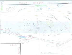
For my hand-drawn map, I thought it would be fun to test my own knowledge of one of my favorite areas in the whole world–the Nebraska Sandhills, as well as the Panhandle region to the west and some other surrounding locales. So I put a piece of paper over the map of Nebraska in my Rand McNally atlas, centered it over the Sandhills, and used a ruler to mark the part of the state border which showed, and marked that in pen. Then I put the map away, got out the colored pencils I borrowed from my son, and filled out the map from memory as best I could.

Nebraska hand drawn map0001

Cartographies of Time

Kinda late getting this post in, and I can’t find the cool flowchart of pre-to-post grunge Seattle bands I was going to use as an example of a pen-and-ink graphic approach to visual representation of multiple, intersecting strands of chronological change. So I’ll just say that this was one enjoyable read, that I’ll definitely be keeping this book lying around as a “coffee table book” for guests and family to peruse, and that I found the central thesis–that the timeline is not some obvious, purely utilitarian function that evolved naturally from the study from history but actually a product of modernity and the print revolution–to be both surprising and enlightening. 

Geographic Literacy in the Early Republic

Martin Bruckner’s “The Geographic Revolution in Early America” traces the process by which evolving norms of “geographic literacy” educated Americans to consider their relation to the national polity, and the emerging nation’s relationship to both competing European empires outside its borders and native nations within. It’s a fascinating read.

My favorite aspect was how unexpected the parameters of his area of study were. I expected to read about maps and geography textbooks. I did not expect to find connections between geographic literacy and early American novels, or between geography as a subject and pedagogy as an ideological, nation-building project. And the section on the Lewis and Clark expedition was, I imagine, much more interesting than anything Stephen Ambrose has to say about their journey.


“Map In Our Lives”

The Library of Congress digital exhibition “Maps in Our Lives” is based on a series of chronologically-ordered maps of land that George Washington acquired in the 1760s. This land was adjacent to his Mount Vernon estate. Not only does the exhibition track the changes in ownership and land use, it also demonstrates changes in cartographic techniques.

What most struck me after looking the site over, however, was the realization that all these maps, created over a period well exceeding two centuries, were “framed” quite similarly. This is because all these maps are concerned with private land ownership, either exclusively of or including the “River Farm” property.

This is a small insight (maybe trivial, even), but still worth remembering. While noting the changes and improvements in the survey plat, or any other map genre, it’s important to note continuities and constants.